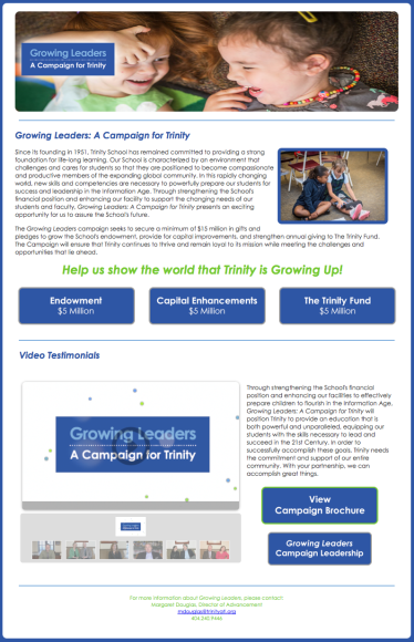
When Trinity School announced the public phase of its capital campaign, it became one of my biggest projects for that school year, as I was charged with designing the microsite and producing the testimonial videos. I created the site from scratch in Dreamweaver using a cascading style sheet, and I created every graphic and button featured on the site.
As most sites do, it went through quite a few revisions before officially launching.


The most advanced component that I implemented is the video slider at the bottom of the home page. The coding for this was pretty complex, because I had to contend with the slider in the site’s header, which was important to me; I really wanted transitioning photos as opposed to a static header. So making those two work together took hours.
Finally, I included an intro for each of the video testimonials, but unfortunately, it was suggested that the look and feel of it was too much of a disconnect from the look and feel of our brand. I don’t necessarily agree, and personally, I loved it (more than I like the one in the final versions) so I kept it for my own “blog-folio” (below). The first clip shows my preference; I love the ribbons and the way it all (music, motion, graphics) makes it look like the launching of a campaign, like something truly exciting is being announced.
Pingback: School Website Redesign – Sharmaine Mitchell