
Trinity School’s website had not seen major design updates since its redesign/overhaul in 2007. As the school planned to undergo a major overhaul of the entire website (CMS and front-end design), I manually redesigned the site to update its look.

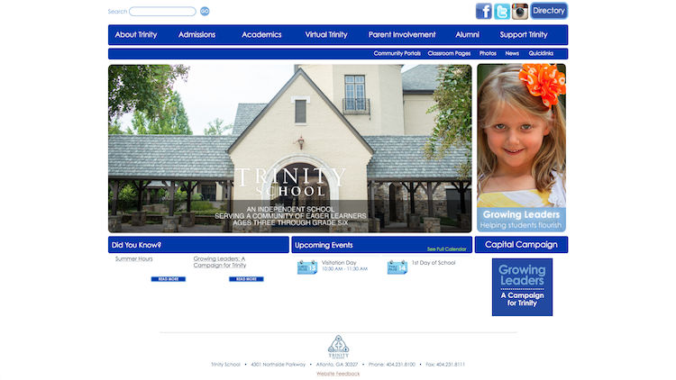
Trinity’s most recent website was launched in 2007, so it was long overdue for a major face lift. I gave it a minor face lift during the summer of 2012, updating the colors to coincide with our new branding platform and visual identity, but the overall look of the site was outdated. The gradient background needed to go, the Flash movie on the home page needed to go, and the site needed to be wider (The entire site was contained within 760 pixels, which was fine for 2007 and a few years beyond that); those were the main three things.
Besides a new design, however, the site is in need of a complete overhaul. The content management system needs to be updated, and naturally, Trinity’s needs as an organization have changed since the site was built in 2007. There are so many systems operating right now that need to be more streamlined, but planning for this takes time and strategic thinking, so the plan is to overhaul the site for next school year (2015-2016), but for now, we couldn’t live with the design any longer. After seven years, it was just time. The challenge with this project was to update the site, but not to make such drastic changes, that next year, when it’s overhauled/redesigned, it looks like there were two major redesigns in the span of one year. The idea was to, for the most part, leave elements where they were. Of course, the change will still be noticed next year, but this was more of a “same great website, slightly different flavor” type of thing.
So I manually dismantled the entire CSS, which was no small feat. In February, I let our developer know that I would be handling the redesign this summer, and our rep told me to let them know if I “hit a wall” or if I wanted “to connect with one of [our] production experts prior to getting started.” He said, “Sounds like you just need us to backstop you on the site changes you plan to make.” While I have to admit that it gave me comfort to know I had them “on standby” as I embarked on this huge project, I am more than proud to report that I never needed their assistance! Words can’t possibly express how excited I was to discover I was capable of this! Designing a website is a very different animal than redesigning a website you didn’t initially build, and “anxious” doesn’t begin to describe what I was feeling prior to starting this project.


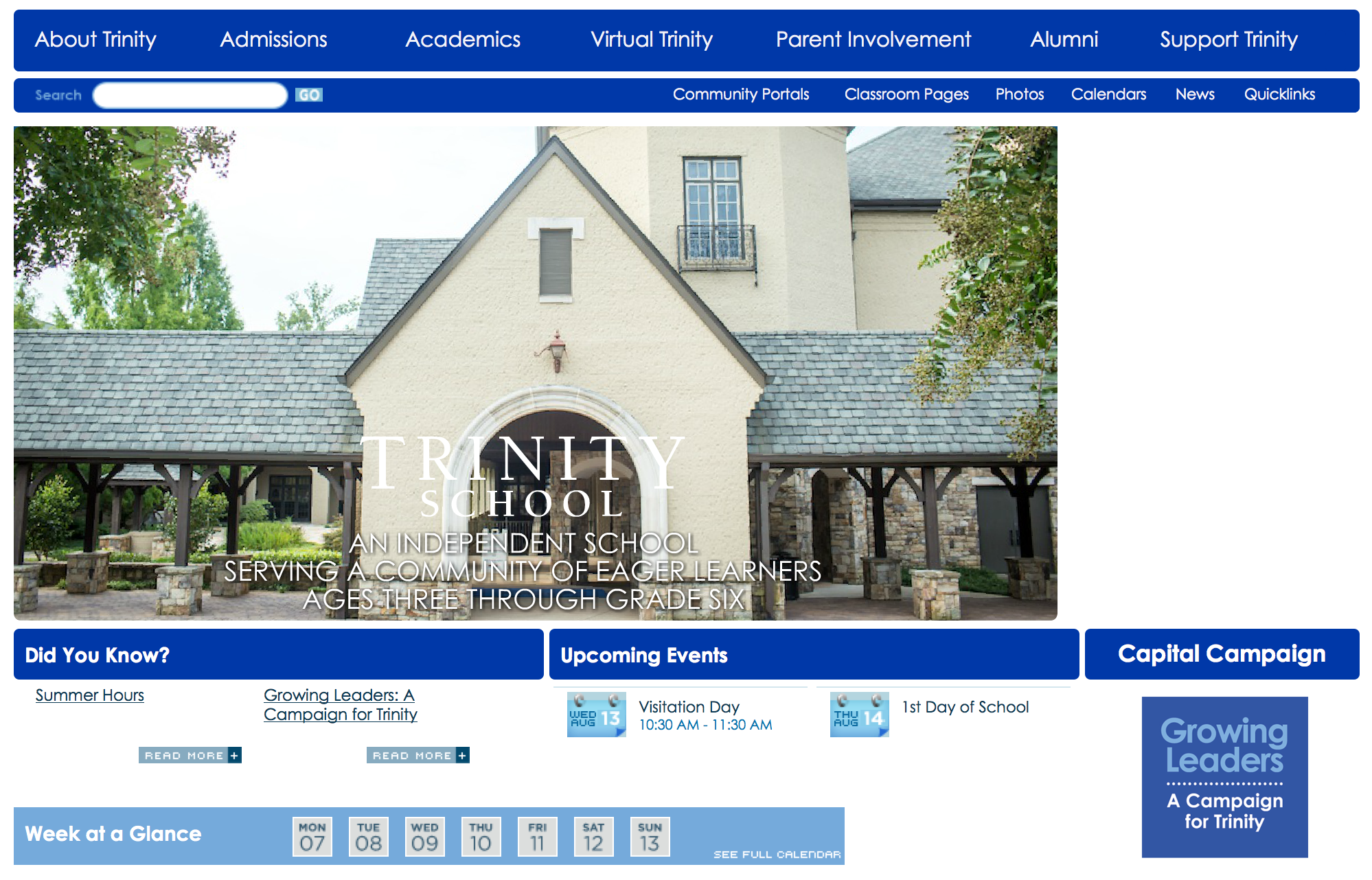
I started the process on June 18, and I took this screenshot (below) on July 9. At that point, I was just planning on increasing the size of the photo to span across the entire page. But I showed it to the Director of Marketing & Communications at this stage, and she had a few thoughts: completely remove the “Week at a Glance” module, move the footer icons (not pictured below; they were in the way during the coding process) to the top, and insert a “Flash-like movie” on the right side, instead of expanding the size of the static photo. So a large part of this project was designing and coding the “slideshow” using Javascript. I had a little experience from when I built the header for the campaign microsite, but this one was a little more complex.
Because most of the graphics complimented the former design, they looked outdated with the new design, so I had to update a lot of those. If you look closely, you’ll notice that even the “rings” at the top of calendar date icons in the “Upcoming Events” area have been updated, along with the “Read more” buttons in the “Did You Know?” area.
Overall, I spent seven full work days on this redesign (June 19 & 25; July 1, 7, 15, 16, 17). I rolled it out on July 16, and spent a day making adjustments.