What Am I Proud Of?

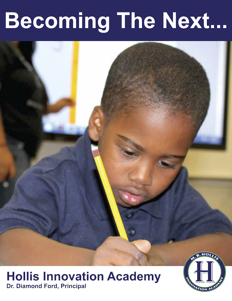
The principal at Hollis opened last week’s Leadership Team meeting by prompting us to answer the question, “What are you proud of?” I had arrived really early that morning, when the building was very quiet, and as I walked around, I took some moments to take it all in.

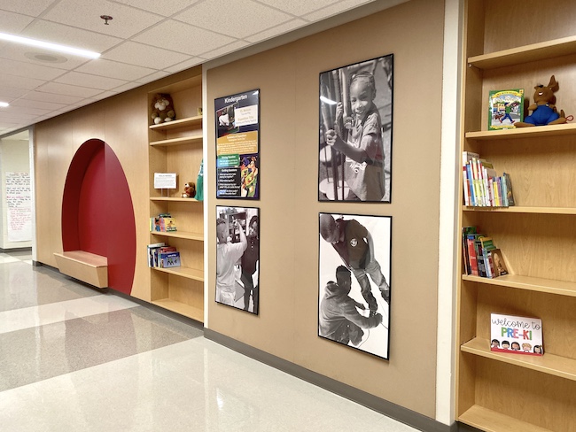
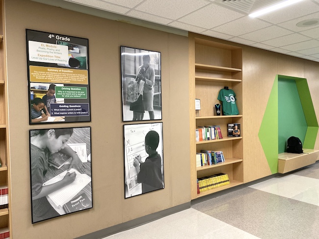
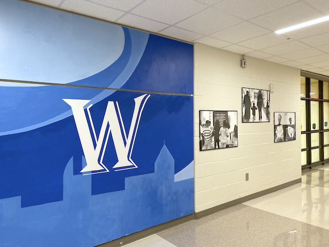
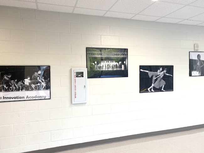
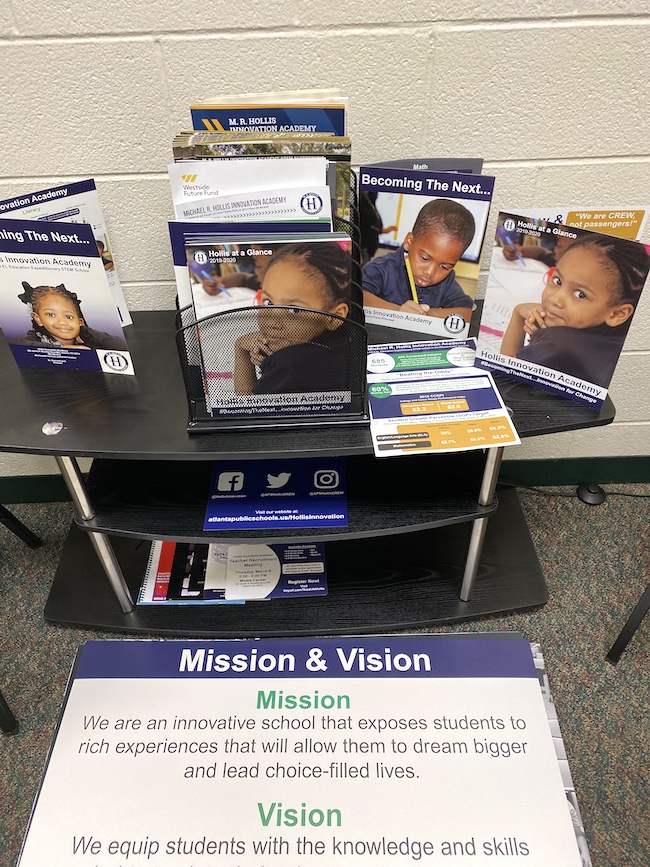
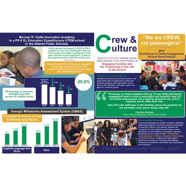
This project was such a huge undertaking: collecting, editing, and formatting more than 100 black and white photos for large prints; designing and printing grade level posters and oversized Design Thinking signs; analyzing data, designing, and printing a bi-fold publication. And with a great team, we placed and hung all of these!

Lots of long days and late nights, but I’m proud. There’s a lot more in the queue, but I was grateful for the chance last week to exhale and reflect on it all. And I’ve said it before, but I’m beyond grateful for where my professional journey has led!

Refreshing a Brand

As I was beginning a reprint of Hollis Innovation Academy’s general brochure, I felt like the brand needed refreshing, even though we were only entering into the school’s third year. Since I began the role of Marketing & Media last year, I used the trademark blue and green (with white) for everything, and I felt that it was time to “expand” the brand, if you will. It needed refreshing; there wasn’t a full color palette, so I spent a considerable amount of time to come up with this one…and I love it!

Prior to this project, I had used several tools for developing color palettes, but Coolors is amazing, because it has a feature that allows users to “lock” more than one color, as opposed to many other sites that only allow users to set one base color. So in my instance, midnight blue and kelly green were non-negotiables, as they are already Hollis’s two main colors. I needed three more colors that were appealing and accurately reflected our brand.

Some Brands Are Just Plain Fun

Kool Pix ATL Brand Board

During the past few weeks, I’ve done a lot of marketing for Kool Pix ATL. In the interest of full disclosure, it’s my family’s business. We are a professional full-service photo booth company, and we have been absolutely blown away by how much we’ve been working the past couple of months! And I’ve had so much fun with marketing!

Overall, it’s just a fun business, so developing its brand has been all about FUN! We’re exciting, we’re colorful, we’re spunky, we are your party!

Below are some images I created for use on Kool Pix ATL’s website and social media platforms.

*We recently made the decision to change our wordmark and capitalize every letter in ATL, so previous images still include “Atl.”


A push for users to book events
We had just booked an event for January of next year (in June of this year!), so I took this photo to urge people to book events early.


A display of a photo album, an additional feature available to customers
I took the background photo using ribbons and a white background, then I used Photoshop to insert the images of the photo album.


Social Media Station
I used these 3 images to showcase the use of our social media station, a feature now included in every standard booking.

I kinda have a thing for numbers and circles

I took a brief walk down memory lane this morning after running across some old files from my last job.

I created these for social media for the 2014-15 Trinity Fund. I love the vibrant colors I was able to work with. The green, especially, was great for capturing attention on social media.

I created this infographic (below) for an event for new parents. While the color palette is the same, the colors aren’t as vibrant, as they were printed pieces to be included in travel coffee mugs.

I love telling a story using stats, and using different colors, shapes, and placement for emphasis. This is the kind of work that drives me!