Tag: Communication
Refreshing a Brand
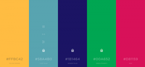
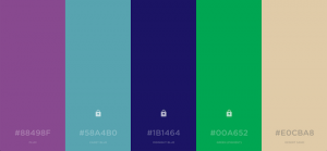
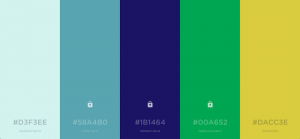
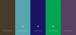
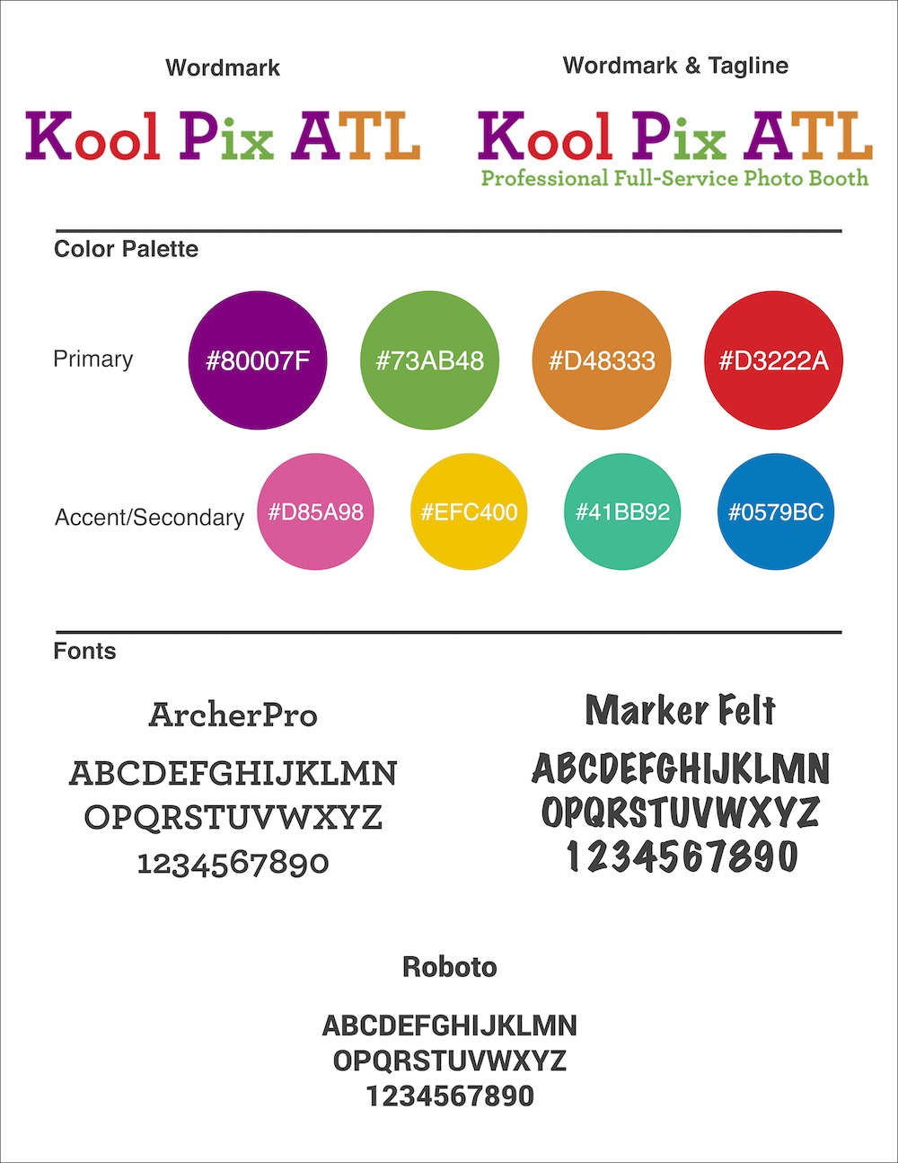
As I was beginning a reprint of Hollis Innovation Academy’s general brochure, I felt like the brand needed refreshing, even though we were only entering into the school’s third year. Since I began the role of Marketing & Media last year, I used the trademark blue and green (with white) for everything, and I felt that it was time to “expand” the brand, if you will. It needed refreshing; there wasn’t a full color palette, so I spent a considerable amount of time to come up with this one…and I love it!
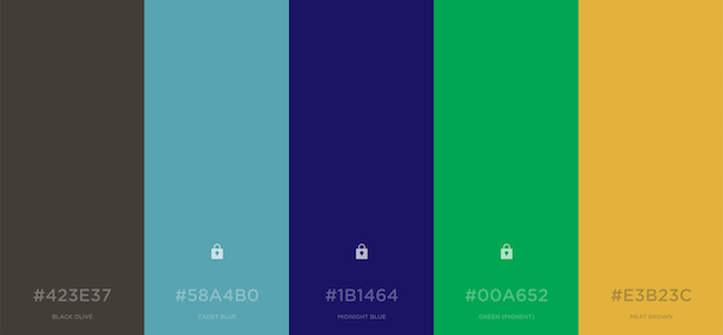
Prior to this project, I had used several tools for developing color palettes, but Coolors is amazing, because it has a feature that allows users to “lock” more than one color, as opposed to many other sites that only allow users to set one base color. So in my instance, midnight blue and kelly green were non-negotiables, as they are already Hollis’s two main colors. I needed three more colors that were appealing and accurately reflected our brand.


Gotta Keep It Green in Marketing & Communication
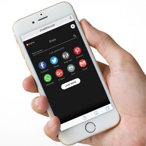
 I FINALLY got around to retaking the photo for my website header last week, and it’s something I should never have had to do in the first place. I broke one of the basic rules of design/marketing/communication: Whenever possible, make content “evergreen”!
Below is the former photo I used for my header. See the error?
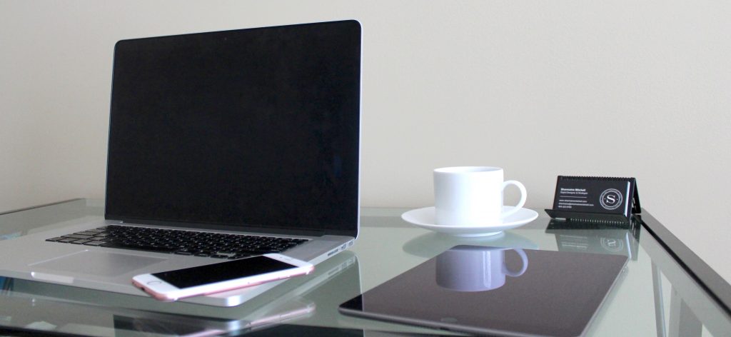
I included my business cards in the photo, which I loved at the time and had no plans of changing. The thought had not crossed my mind. But we all know these things change! And sure enough, I recently changed my business cards…

…drastically! The entire look and feel changed, and it was bugging me that this photo remained on my home page. I have an instance (i.e., Instagram) where it’s cropped, but because of the aspect ratio, that photo wouldn’t work as a replacement header photo. So in essence, that header photo is now obsolete, as it pertains to my business. I added more work to my plate by having to recreate the photo, because I broke the “evergreen” rule.
My mistake wasn’t necessarily that I chose to include the business cards; you’ll notice that I still included the new cards in the updated header photo. My mistake was that I didn’t take any photos without any cards! That would have left me with some flexibility to use that image in other places if I chose. So this time around, there are two photos: one with cards and one without.


Obviously, not all digital content will be evergreen, but creating content that can be easily adjusted and/or re-purposed makes life so much easier. I dropped the ball on this one, but rest assured that I’m hyper focused on it now!
Some Brands Are Just Plain Fun
During the past few weeks, I’ve done a lot of marketing for Kool Pix ATL. In the interest of full disclosure, it’s my family’s business. We are a professional full-service photo booth company, and we have been absolutely blown away by how much we’ve been working the past couple of months! And I’ve had so much fun with marketing!
Overall, it’s just a fun business, so developing its brand has been all about FUN! We’re exciting, we’re colorful, we’re spunky, we are your party!
Below are some images I created for use on Kool Pix ATL’s website and social media platforms.
*We recently made the decision to change our wordmark and capitalize every letter in ATL, so previous images still include “Atl.”
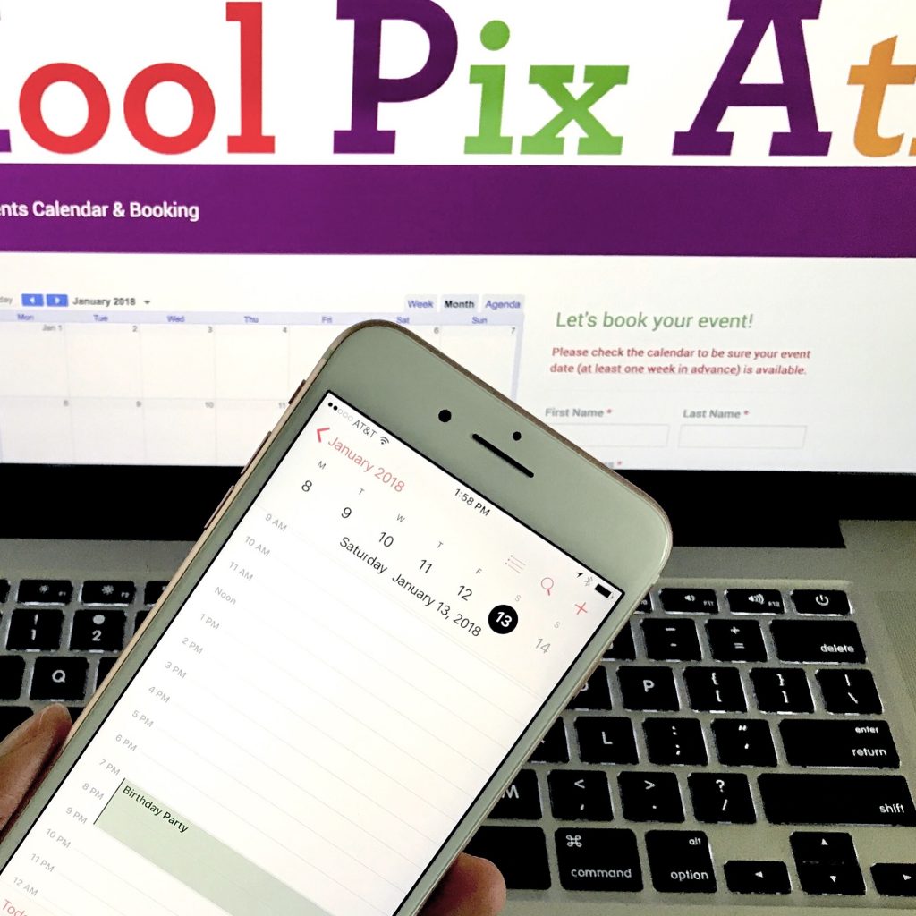
A push for users to book events
We had just booked an event for January of next year (in June of this year!), so I took this photo to urge people to book events early.
A display of a photo album, an additional feature available to customers
I took the background photo using ribbons and a white background, then I used Photoshop to insert the images of the photo album.

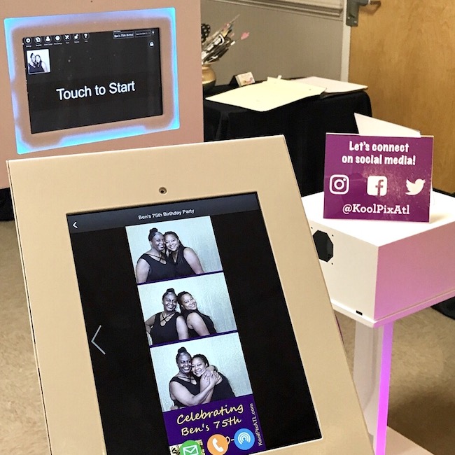
Social Media Station
I used these 3 images to showcase the use of our social media station, a feature now included in every standard booking.

I Don’t Believe in “Cutting Corners”
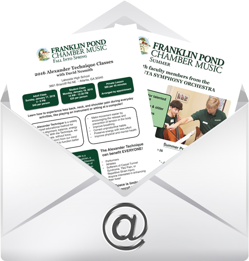
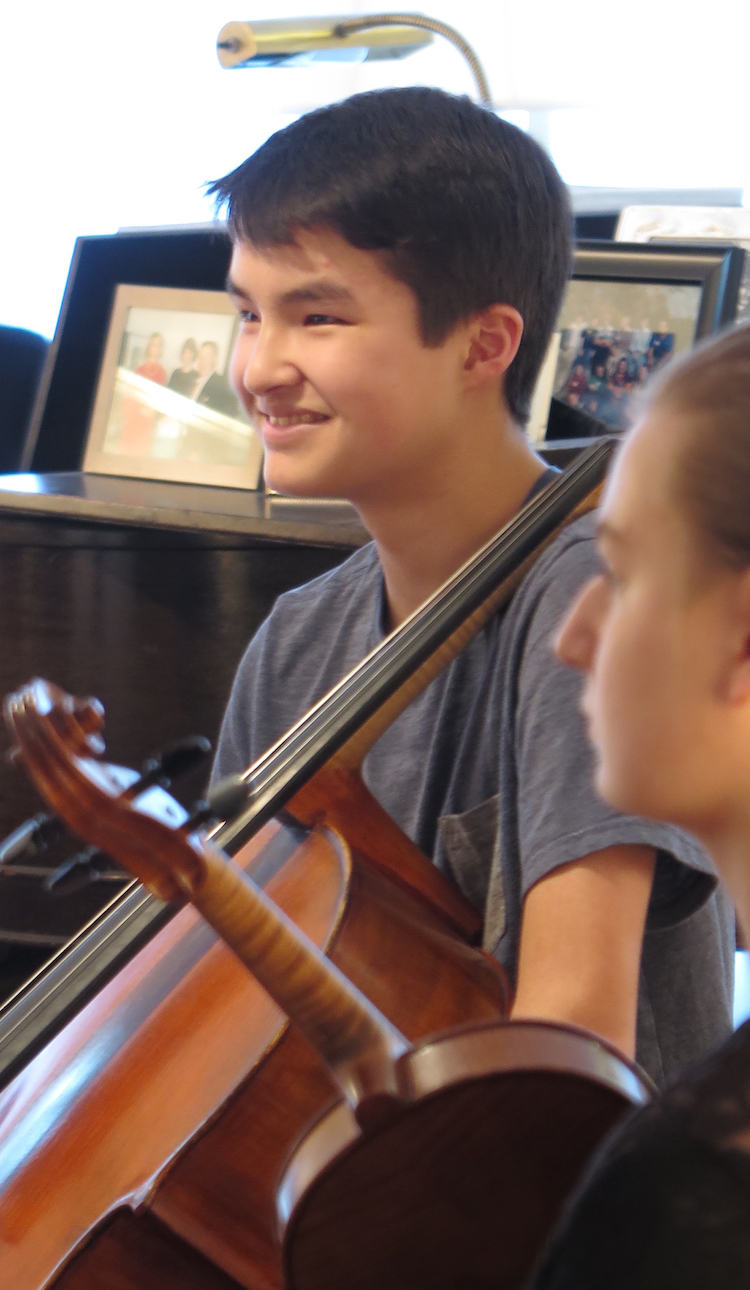
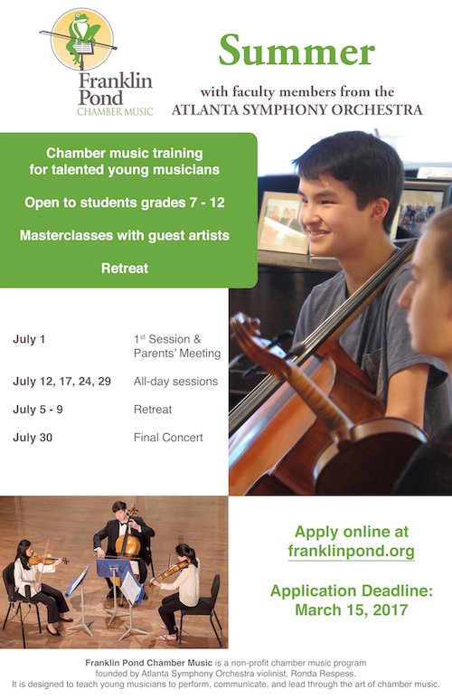
I recently designed a print piece for Franklin Pond, a local youth chamber music organization. One of the photos the director chose had the date printed in the bottom, right corner. Rather than crop the photo and lose some of the height and the instruments’ details, I used Photoshop to remove the date for a more professional, polished look.

I love the powerful tagline this school uses!
Independent schools are currently in the throes of Admission season, so it’s no surprise that as I scroll through my Facebook news feed, I see quite a few sponsored posts from schools about open house events…more than I can remember seeing in the past. More and more schools are beginning to tap into the power of social media to tell their stories and get the word out beyond the boundaries of their communities, and many are understanding that the return on investment for advertising via social media can be immense.
While I can’t speak on other cities, I can say that the independent school arena in Atlanta is beyond competitive…on both sides. Parents scramble to get their children admitted into what they consider to be the best schools (and the planning/positioning starts early), and schools constantly strive to differentiate. Visually speaking, many schools can look quite similar in nature, so while word of mouth (particularly, constituent experience) is HUGE, it’s also important for schools to stand out in some way.
And that’s what St. Martin’s Episcopal School has done. They nailed it!
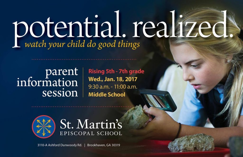
I have seen numerous ads about admissions-related events from independent schools during the past few months, but none jumped out at me like this one. I worked in the after-school program at St. Martin’s in college, and as part of my Communications minor, I interned in the Development Office. So I’m familiar with the school’s visual identity. I love that as part of this change, they remained true to who they are. They kept the school’s original crest, and they incorporated the colors well into the copy of this ad.
The clincher for me is the tagline: potential. realized. watch your child do good things. How incredibly simple, but so powerful! Don’t we all want our children to do good things? Don’t we all want them to realize their potential? As a parent, this ad would absolutely pique my interest in the school and consider attending the information session, if nothing else. And that’s the idea: Get them in the door, and we can take it from there.
Awesome job, St. Martin’s! Keep up the great work!