High Quality Photos

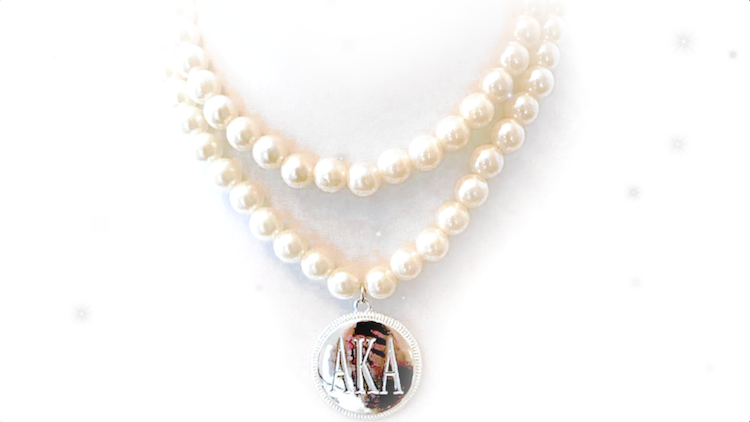
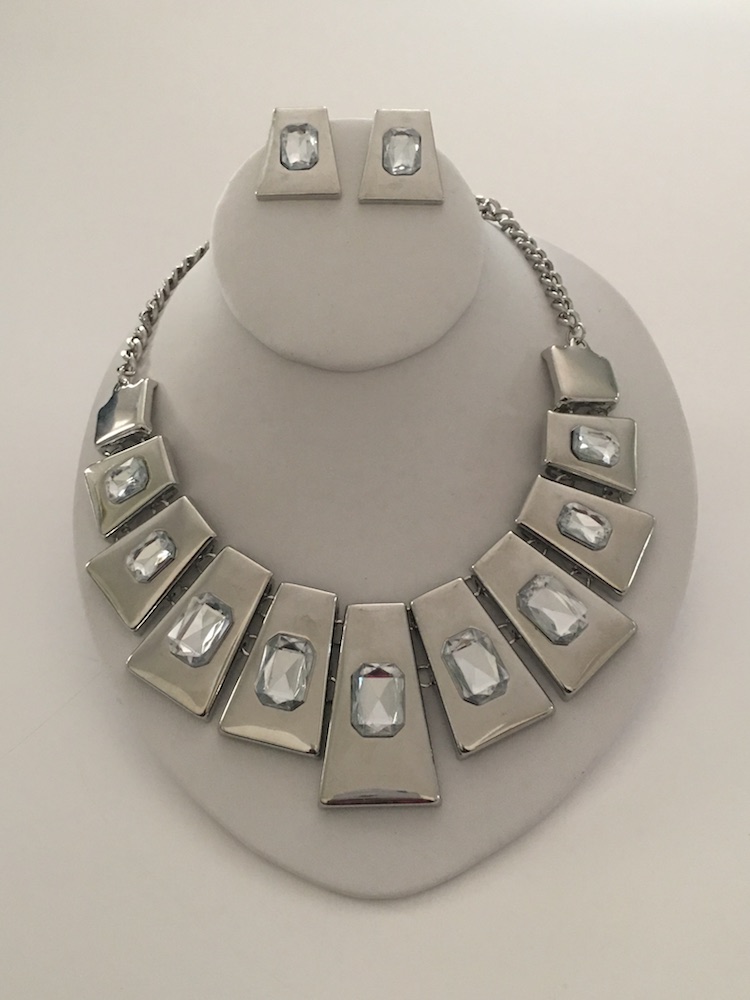
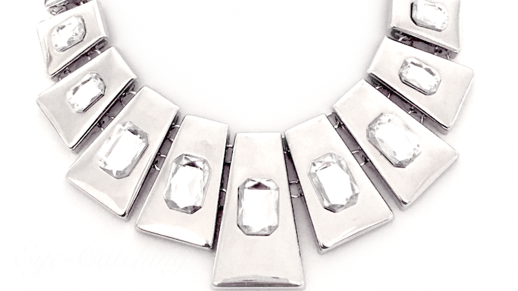
For this product promotional video, I edited original photos sent by the client, using Adobe Photoshop. In this day in age, it isn’t difficult to obtain high resolution, quality photos; most of our smart phones are capable of producing impeccable images. But when I want my photos to have a little extra “umph” (depending on the project), I don’t rely on my phone.

However you choose to capture photos for marketing purposes, ALWAYS invest in quality. Sometimes that might mean hiring a professional photographer, or it could be something as simple as purchasing a nice DSLR camera. It’s definitely worth the investment, especially if you’re paying to use the photos in other projects. For this project, for instance, imagine if the original photos were used in the promotional video…hardly dazzling, right? So in a case like this, if you already have photos that are less than desirable, it’s worth it to invest in a professional to “spice them up.”
Some Brands Are Just Plain Fun

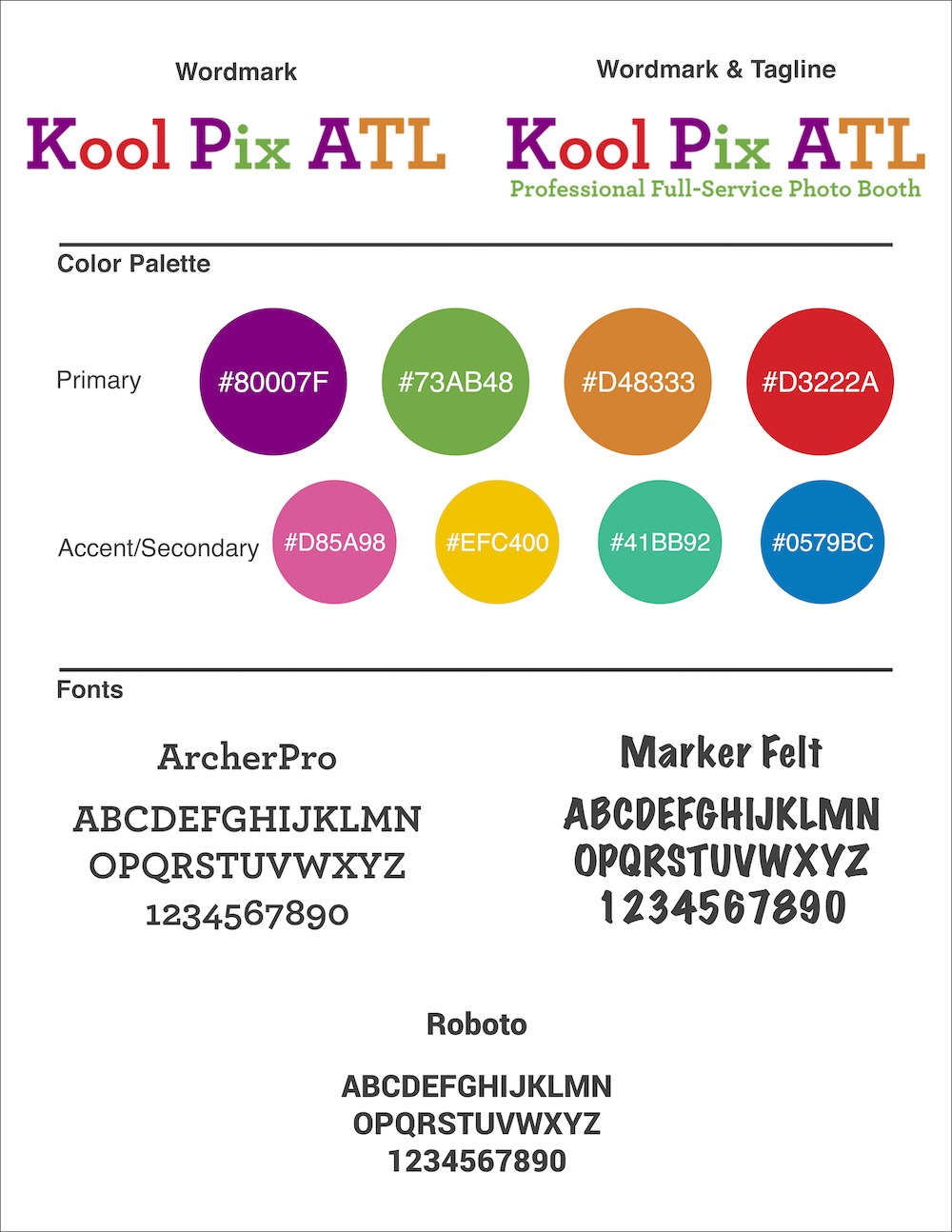
Kool Pix ATL Brand Board

During the past few weeks, I’ve done a lot of marketing for Kool Pix ATL. In the interest of full disclosure, it’s my family’s business. We are a professional full-service photo booth company, and we have been absolutely blown away by how much we’ve been working the past couple of months! And I’ve had so much fun with marketing!

Overall, it’s just a fun business, so developing its brand has been all about FUN! We’re exciting, we’re colorful, we’re spunky, we are your party!

Below are some images I created for use on Kool Pix ATL’s website and social media platforms.

*We recently made the decision to change our wordmark and capitalize every letter in ATL, so previous images still include “Atl.”


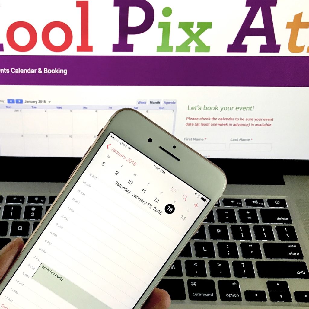
A push for users to book events
We had just booked an event for January of next year (in June of this year!), so I took this photo to urge people to book events early.


A display of a photo album, an additional feature available to customers
I took the background photo using ribbons and a white background, then I used Photoshop to insert the images of the photo album.


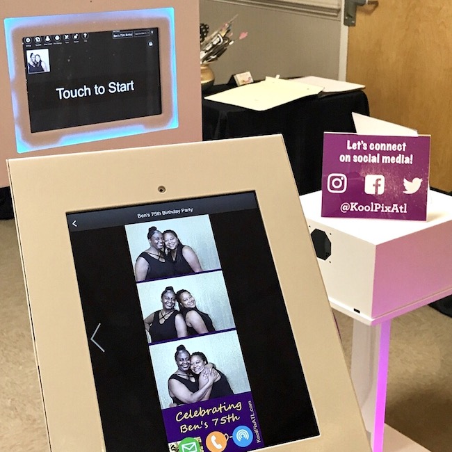
Social Media Station
I used these 3 images to showcase the use of our social media station, a feature now included in every standard booking.

I kinda have a thing for numbers and circles

I took a brief walk down memory lane this morning after running across some old files from my last job.

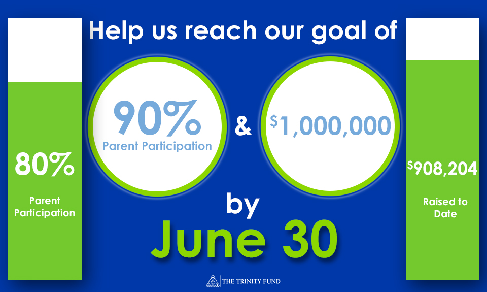
I created these for social media for the 2014-15 Trinity Fund. I love the vibrant colors I was able to work with. The green, especially, was great for capturing attention on social media.

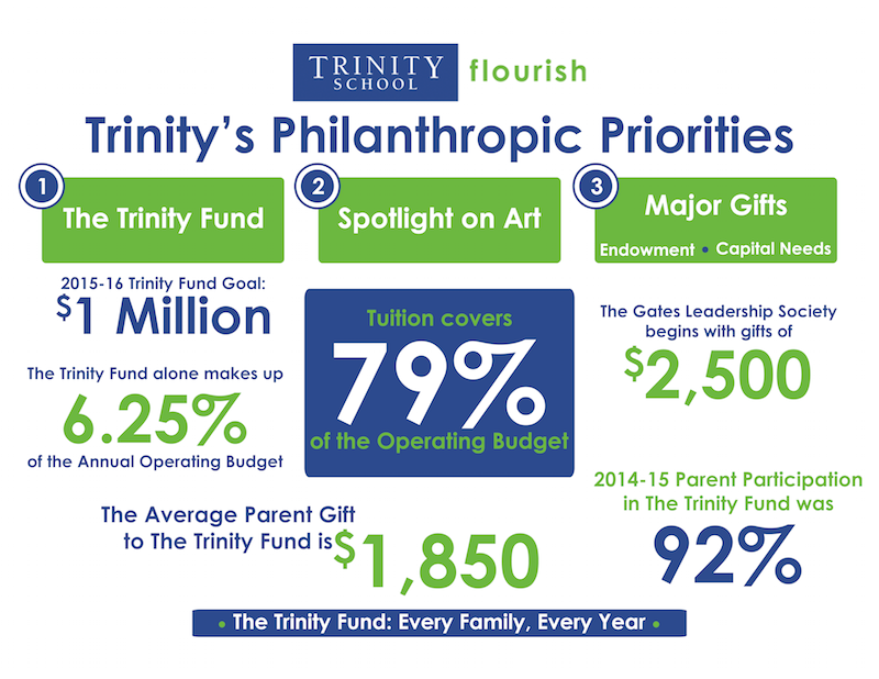
I created this infographic (below) for an event for new parents. While the color palette is the same, the colors aren’t as vibrant, as they were printed pieces to be included in travel coffee mugs.

I love telling a story using stats, and using different colors, shapes, and placement for emphasis. This is the kind of work that drives me!

I Don’t Believe in “Cutting Corners”

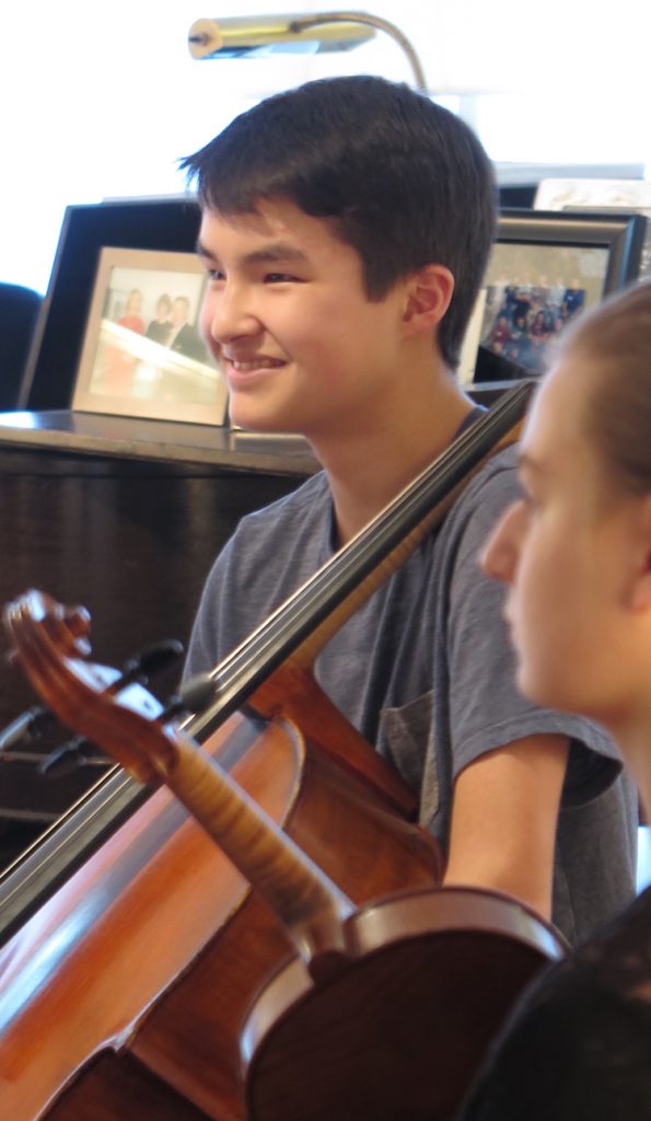
I recently designed a print piece for Franklin Pond, a local youth chamber music organization. One of the photos the director chose had the date printed in the bottom, right corner. Rather than crop the photo and lose some of the height and the instruments’ details, I used Photoshop to remove the date for a more professional, polished look.


1st Grade Empathy Lesson

I produced this video to creatively share with the larger school community what I witnessed while visiting a 1st grade classroom.